Translate

Tuesday, June 21, 2011

Layout for a swap

This is a layout I did last fall actually, for a swap I was in.  The recipient's favorite colors were blue and orange (her college colors).  I enjoyed using the rub-on flourishes, which "picked-up" on the ones in the decorative background papers and the overlay fit in nicely - she seemed to be very happy with it!
I think I should create something similar for myself, I really liked the outcome of this layout.
Have a fun day!

Saturday, June 18, 2011

A couple more simple journal pages in a swap


these are  two pages I did recently in a journal that was for Swap-Bot, had to journal for the entire month, write, draw, collage, put in photos, everyday tidbits - these are my favorite kind of journals to swap, what we call an Everything Journal.  The pages are simple, but it is what I "felt" like doing at the time.  On the left I used a piece of scrapbook paper and added a little bit of glimmer mist to it, then some decorative tape around the outside, a scrapbook paper scrap and then some black and white tissue paper images.  The right side is jst a Zentangle/doodle I did while watching tv. 
What have you done in your journal today?


Thursday, June 16, 2011

Simple and Sweet

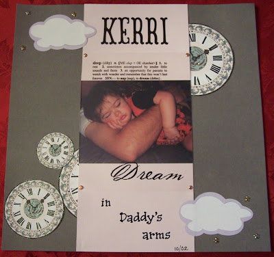
Yes this is a very simple layout, but the photo is precious to me and it is just what I wanted for it.  I used a smokey grey Bazzill cardstock, then clipped the glittery clocks from another piece of scrapbook paper to place strategically on the layout.  A soft pink piece of Bazzill cardstock I laid down the middle to anchor the photo of my youngest, Kerri when she was about a 1 1/2 and on top of that I placed an overlay with the definition of "sleep" printed on it and Dream at the bottom. I used my Cricut to cut out KERRI from the storybook cartridge and "in Daddy's arms" are Recollection mini alphabet stickers. The clouds were made with my Cricut and I used Recollections star brads near the clouds as well as regular brads to secure the overlay.
Hope all your dreams are sweet!!

Wednesday, June 15, 2011

Spring Break Layout

My daughter, the one on the right, took this photo of herself and friend as well as the amazing sunset while on spring break in 2008.  The paper is double sided and is mostly a pink toned paint brush effect on the other side which I originally wanted to use for this layout, unfortunately it over powered the sunset photo so I settle with this side and all the words related to the beach.  I added the headed which is actually cut from another piece of 12 x 12 paper that is all words and phrases; the "ribbon banners" are also cut from the same piece of paper.  I accordian folded a pink strip of paper to give it a ruffled look down the side of the page and topped that with a Making Memories flower and rhinestone and added a few flower bling by Recollections.  The little days of the week card I believe is 7 Gypsies, added a pink paper clip and black Alphabities.
Wish I could be at the beach in Florida, or for that matter Kiawah Island, SC right now too!

Tuesday, June 14, 2011

Connecticut Scrapbook Page

A sweet photo of my youngest daughter during our trip to Connecticut in summer 2009.  Background paper is by K & Company called Polka Dots on Text Flat Paper, other papers on layouts are coordinating pieces from that line: I layered 5 pieces on the left side in various lengths and widths and even took the brown piece and gave it an accordian fold for a ruffle look, the same way I did with it under the photo.  The flower I made using Tim Holtz' method with his wonderful tissue tape, inked the edges and added a greem gem brad by Recollectdions. I also used a piece of the tissue tape over the top of the photo to "anchor" the "plastic" sticker word: beautiful.  The words "in" and "Connecticut" are sticker letters with text on them - sorry do not remember the brand.

Sunday, June 12, 2011

Scrapbook Page with colors I would not have figured go together...

Unfortunately the lighting in the picture did not help to show the strong color of the greens here.  If these two papers had not been in a kit together, I never would have paired them - I guess I am a bit color coordinating challenged..sigh....
I knew the background paper was perfect for the one photo my daughter had of her weekend trip to Chicago, but I wanted a couple more pictures, since she did post the larger photo to Wardrobe-Remix on Flickr, then I was ok with adding a couple others pics that had been loaded there.  So the layout conveys her trip to Chicago but also a few of her wardrobe-remix outfits.  I used my Cricut to create "the windy city" and the CHICAGO border, added some Recollections flowers and pearliscent brads along with Making Memories metal photo turn and brad as well as a metal tag from Tim Holtz line as well as using his wonderful tissue tape to create to create the ruffled edge under the photo, also added a little butterfly that was received in a swap.  Several items are "popped up: using Zots and foam pop dots.
What have you made lately? 

Saturday, June 11, 2011

Some Journal-Collage Pages

I am inspired by the assortment of images and texts I see in every single magazine I look at.  I love to combine them for an entirely new perspective and message.  These pages are from a journal I did in a recent swap through SwapBot.com

More tomorrow...

Friday, June 10, 2011

Friday: A PAINTING

Yes - its Friday and it is raining - so glad it is - I've wilted from all the 90 + temps for the past week and this rain is very welcome - I don't need to water now - yippeee! 

VERY HAPPY AND PROUD to share an acrylic painting my oldest daughter, Morgan did for her sister, Kerri .


Hope everyone's Friday is a good one!

Thursday, June 9, 2011

More card creations to share and a SUMMER GOALS LIST...


Yes, more cards to show that Kerri an I made together, three of these are all ideas we saw on You Tube and a Craft magazine. The cupcakes card idea is compliments of butterflykisses12 at http://www.youtube.com/watch?v=orRAK1Zi-Ikhttp://www.youtube.com/watch?v=orRAK1Zi-Ik . Our card is bigger and our cupcakes are were made using the Cricut and instead of a round punch - which I was unable to locate mine - we used a square punch. The little "grunge/rock" boy is from the norsugirl at http://www.youtube.com/watch?v=TLi2oI_84zs (she has some really wonderful ideas and these Greeting Farm stamps are adorable!!!) The word bubble says It's Time and inside the card we put TO ROCK YOUR BIRTHDAY and added a "guitar" that started out as a Tim Holtz grunge board hinge that was inked. He also has cardstock "wings" with gems and is on an embossed and inked card stock that I felt kinda looked like "records" hanging - all that on top of scrapbooking paper. The Grad card was in an idea book, simply "graduation" scrapbook paper w/ the silver mortar boards on it, added letters spelling grad, then the felt butterflies with gems and finally typed out "spread your wings and fly..." The last one was very fast, an embossed and inked piece of card stock with "thank you" in various lanuquages, with gems, on a piece of scrapbooking paper and a few felt flowers added. 
    
      As to my SUMMER GOALS LIST, as inspired by Elsie over at http://www.abeautifulmess.typepad.com/, well here they are:


SUMMER GOALS:
#1  get back to the gym every morning because I definitely NEED it!!
#2 Keep up with my blog!
#3 Work on making journals and more layouts to post onto Etsy.com
#4 Go on more mini 2 day trips - canoeing, hiking, visiting museums, just site seeing in general
#5 Clean out the basement completely!
#6 JOURNAL EVERYTHING EVERYDAY!!

Looking forward to the weekend, The Italian Festival (yes - hubby's side is!) and anothe baseball game as well as a tennis match and grilling out some steaks, yummy! Hope everyone else has nice plans too!

Wednesday, June 8, 2011

Crafted cards with youngest for school project

My youngest, Kerri had a school MINI SOCIETY project to do in May, just befor school ended.  She had to choose a product to make, keep a taly of what she spent, her time and price it to "sell" at school with "money" the kids all earned the previous month.  Of course she chose CARDS because of all the "goodies" I already have on hand.  These are a few we made: the pink one is just a collection of floral embellishments and stick on gems, with a border added, very easy to make. The purple one is card stock with a piece of scrapbook paper added and flowers cut from the Cricut machine, gems added, a typed message and adorable little memo "tickets" that we inked. The yellow one is cardstock with a sticker flourish added as well as a saying sticker at the bottom, Prima flower added with a brad center and some felt butterflies with gems, the last one we "scrap-lifted" from thestampgoddess on youtube: http://www.youtube.com/watch?v=Yv1thrMi6H8  she used stamps alot, we did not use any, unstead a Cricut cut cupcake, and mini alphabet stickers and lots of gemstones - had to move it again as the center kept shifting on it.
It was an enjoyable afternoon with my very creative and crafty 10 year old, more to share tomorrow.